LUI
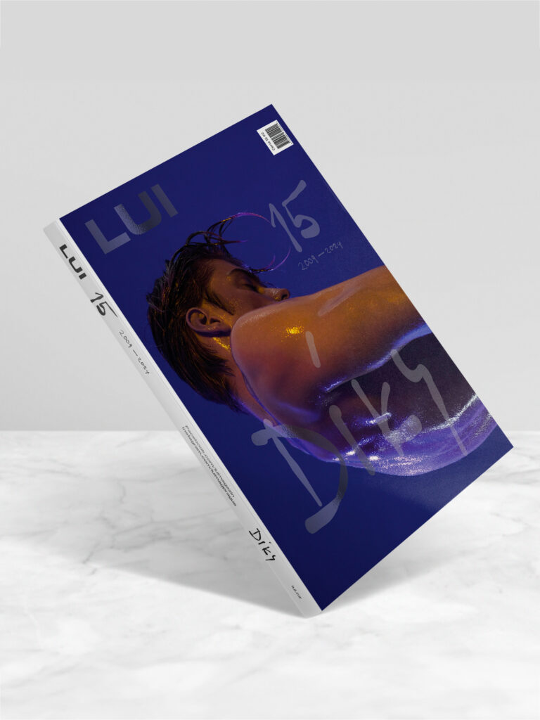
LUI/MAGAZINE GRAPHIC IDENTITY The main objective of this project was to create a unique aesthetic expression for the magazine that can engage and captivate readers. The foundation of the new design lies in the creative use of colors, typography, and visual elements specifically tailored for LUI, reflecting its character and values. The graphic treatment focuses […]
KUFRKAFE
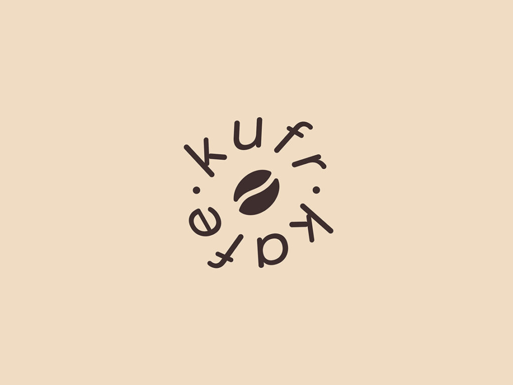
KUFRKAFE The logo is a dynamic stylization of a coffee cart’s wheel. This wheel is a key element representing the mobility and energy that Kufrkafe brings. The outer part features the text “Kufrkafe” and creates a circular shape around a coffee bean. This element symbolizes the roasting process, which releases a unique aroma and flavor. The use […]
NATIMBER
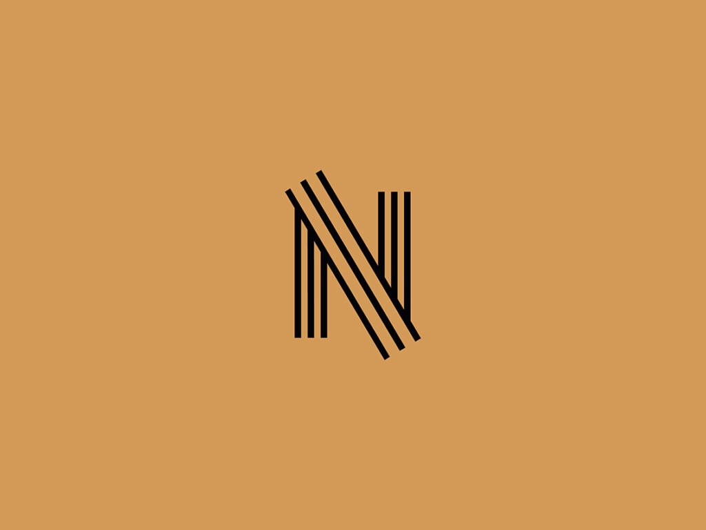
NATIMBER Young, innovative, dynamic. A company specializing in custom furniture manufacturing, fueled by individuals for whom woodworking is simply a passion. The main feature of the logo is the letter N, symbolically composed of wooden planks. The color scheme and specially tailored typography for Natimber give the company energy and credibility. 2020 Client: NatimberType: Logo